


Today I'm guest blogging on Susan Johnston's very informative The Urban Muse, which has reams of great information on writing, blogging and freelancing. I started reading it one day and realized well over two hours later that I was still reading, which only happened before when I discovered TV Tropes.
My post is about the pros and cons of starting and maintaining a blog. Check it out and leave a comment if you like!
This is the promotion for today. Yesterday I joined a private board where I knew most of the people from another board years ago; just didn't have time to catch up with them while classes were going on. So that's one more community which now knows about the book.
****
Yesterday I was looking at romance novel covers on other bloggers' sites, like this one from Viv Arend.

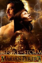
And that's when I realized that I actually prefer not to see the hero on romance novel covers. There's a preference for what's referred to as "mantitty" - marketing shows this, so of course cover art responds. At least it's better than Fabio, IMO.
But neither of them work for me, oddly enough. Maybe because the visuals of men I find hottest are the ones in my head? A reader's imagination is often more powerful than what even the best cover art can provide.
There are only a handful of heroes whom I did like seeing on covers, and even then one of them was only visible from the neck down. Plus, he was wearing a (buttoned) shirt and slacks.
On the other hand, I do enjoy seeing heroines on covers, so the intense gaze of the woman on the cover caught my attention. I especially love heroines wearing beautiful dresses suited to that time and place.
Well, with one exception.

Count the heroine's hands.
6 comments:
Well, she's a scary woman, isn't she? LOL!
And I love the eyes on the woman in my cover. Really fits the story as well...
Castles in the Air--with MUTANTS.
How did no one ever catch this?
Ref: heroes
I'm of the other camp. I WANT to see the hero's face, as long as it matches the description in the book.
In Touch Of Fire, I went through four models before the artist found the ONE.
I completely agree with you about heroes on book covers. They always look stuck up and poncy to me, and I'm sure the ones who would appeal to me could not possibly appeal to other women. Besides, the most important features are impossible to depict in a drawing: if he is kind, has a sense of humor, if he knows how to pick up after himself... And Maria has a good point too: I hate it when the cover does not reflect the book description.
Love that three-handed woman!
Viv - Good color scheme, too. Fits the western theme.
Maria - My theory is that the knight has fallen in love with a Hindu goddess, and she has extra arms where we can't see them.
And wow, four models for your book's cover? But I'm glad the artist made the effort - it showed a committment to getting the cover right.
Mary - Agreed, especially regarding heroes who just seem to be posing with their shirts open. Handsome and high-maintenance, IMO. :)
I prefer it when characters are doing something.
I would read a romance novel about a woman with three arms. That would definitely spice things up a bit.
During the story, the hero should have to leave her. Then the book could be called A Farewell to Arms.
Post a Comment